
05 Aug 2024 My Outlook Ribbon has extra space and missing commands? Help!

Just this morning I received an email from a valued client explaining that they could no longer see all their formatting options in a newly written Outlook email. My client is located in the USA, and I had previously done some Productivity with Microsoft Outlook training with her team. I happened to open her email on my mobile phone just as I took off for my morning walk. Without looking too closely at the email and the screenshot that was provided, I assumed it was probably going to be the ‘simplified’ outlook ribbon issue which I’ve encountered many times before.
Anyway, after breakfast and while getting ready for a day in the office, I opened this email on my laptop and realised that my client’s problem wasn’t related to the simplified ribbon (I’ll address that in another article later). I organised a quick video call to help this her sort through the situation. When I looked at her screen, I realised I had encountered this problem before, though it had been some time ago. The solution didn’t immediately spring to mind.
Thankfully, after some screen sharing and trying a few different things, I suddenly remembered what the issue was and how to fix it. Problem solved! I determined right there and then to write a quick article on this to help anyone else who might struggle with the same issue.
Normal view of the Microsoft Outlook ribbon
Below is a screenshot of how your Outlook ribbon would normally look.
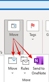
Now here is a screenshot of my client’s Microsoft Outlook ribbon.
Can see the subtle difference? Notice that in the image above the ‘Move’ icon or command is much smaller. The Rules dropdown and ‘Send to OneNote’ option seem to have disappeared altogether. There’s a similar difference in the Tags and Groups areas with, for instance, the Categorize and Follow Up dropdowns nowhere to be seen.
In fact, all the options visible in the ‘normal’ outlook ribbon do exist in my client’s version. It’s just that you can’t see them without expanding the Move, Tags or Groups button respectively (see below). This is definitely not as accessible as having these options visible in the first place.
The Outlook Ribbon in a New Email
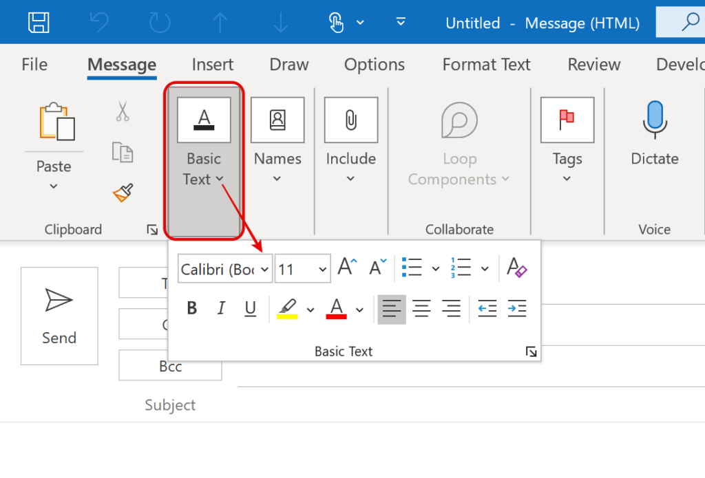
This difference is even more pronounced when you open a new email. The screenshot below shows the ‘normal’ ribbon layout. Below that is what my client sees. Notice how she loses easy access to all the basic text formatting tools.
Normal view
View my client had
Also, in the view above, the Basic Text area has totally collapsed and is only accessible by clicking on the dropdown arrow as I’ve shown you above. This was driving this person around the bend!!
Touch/Mouse Mode
So, what is going on? It turns out that the main factor in all this is the size of the screen on the device being used. As screen sizes drop past some ‘trigger’ size, the ribbon collapses various areas, hiding some options under others, as we’ve seen. By hiding or collapsing the ribbon commands, they keep the main option areas and buttons large enough that they can be practically ‘touched’. This is the default behaviour.
But there is something else going on as well. Windows touchscreen devices operate in one of two modes: Touch mode or Mouse mode.
The Touch option, which is the default, is for when you are using your device without a mouse and navigating with a finger. As I mentioned, the Microsoft Outlook Ribbon Commands are deliberately spaced apart in this mode so that they are easy to use by touch. This will often switch when your laptop’s keyboard is disconnected or removed in the case of a Surface Pro for instance.
The Mouse option, on the other hand, assumes you’re using a mouse or touchpad as a pointing device. It ignores screen size for the most part, returning the ribbon to the same format you see on larger screens.
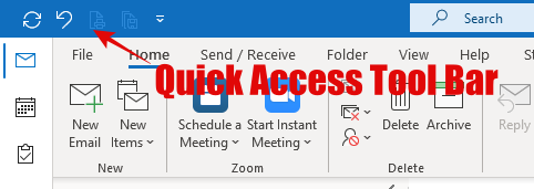
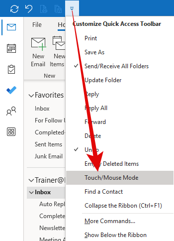
Now here is the tricky part! To switch between Touch mode and Mouse mode, you need to enable the toggle button in the Quick Access Toolbar that sits in the light blue area above or just below the Ribbon. This can be found in the top left blue section of your Microsoft Outlook program, where the Undo button resides (see below).
Quick Access Toolbar
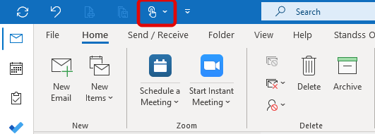
Here is what the Touch Mode icon looks like in the Quick Access Toolbar
On a Windows touchscreen device, it is probably already there. If not, you can activate it by selecting Touch/Mouse Mode under the dropdown button in the Quick Access Toolbar, as shown below.
Switch between Touch or Mouse mode?
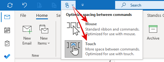
Once the Touch/Mouse Mode button is there, you can switch between the two modes by clicking the down arrow to the right of the icon as shown below.
If you’re having the problem my client did, with all those options hidden away, selecting ‘Mouse’ mode returns your ribbon layout to normal. If you are, in fact, using your finger to navigate the screen and would prefer more space between icons, simply switch back to ‘Touch’ mode. Personally, I find it easier to stay in Mouse mode even if I am using my fingers, but the choice is yours!
It’s a very simple fix in the end … if you know where to find the Touch/Mouse mode icon.
As I said at the beginning of this article, this is a problem that normally only occurs when you are using a Windows touch screen device and with a removable keyboard, but the Touch/Mouse Mode is still there in the Quick Access Tool Bar, so it could be easily accidentally switched. I first discovered the issue when training a group who all had Windows Surface Pros. Not long after that I brought my own first Windows Surface Pro, and I have used this feature regularly since.
And if this has proved helpful for you, leave a comment below to that effect.
Geoff Prior, Lingford Consulting – August 2024
For more productivity tips, sign up to our Monthly Productivity@Work eNewsletter.
Interested in some Outlook Productivity training for your team? See here
I also have a series of pre-recorded Microsoft Outlook training courses you might be interested in. See here


No Comments